
Showing posts with label Planning. Show all posts
Showing posts with label Planning. Show all posts
Wednesday, 1 December 2010
Dgi pack Editing
Below i have taken a screen shot when in the editing process. I have changed the colour of the keys so it looks older. This is not the final piece.


Tuesday, 30 November 2010
Digipack Planning
As a group we have done a vast amount of planning, and we have spent a lot of time deciding on what we would have for our front and back cover of our album. We had planned to have the theme of picnics and tea parties, relating to alice in wonderland and helping to create our artists image. We planned for the title of the album to be called 'stuck on dreams' again linking to alice in wonderland which is a story of dreams and fantasy. We learnt from making our music video that we had to become more organised and manage our time more efficiently, although we tried to do this, by creating a time table with all our available frees, and finding appropriate times to use the hall. We did not manage to shoot our digipack in time, and due to members of the group being absent on different days, there was not many opperunities to take our photos. Due to this we have been forced to re think our ideas, the deadline being very soon. We have gone back to our original plan of using photos we took on the day of filming as the front cover, and therefore the album will now be called 'faces going places', the song we used for our music video. The back cover will be piano keys linking to Jose Vanders and the importance the piano is to her as an artist, and we aim to create a booklet that will be inside the album, however our evaluation seems more important at this time and therefore we may have to abandon that ideas.
Rough Copy of Digi Pack
After editing the image and getting it to the right size , we have produced a rough copy of the back cover which will need further editing, as the colour of the keys will ned to be changed .

Digi pack- CD dimensions
Although we looked at another website for the dimensions, we had to google for more specific measurements. below is a screen shot of how we changed the dimensions in photo show to the size of or digi pack.We had a few problems with changing the dimensions as it cropped our image. After several attempts ! we managed to find a way that cropped the image to the size we wanted it.The screen shot below shows how we changed the dimensions.


Monday, 29 November 2010
Creating the digi pack
We have we have found several pictures which we can use for the front cover and pictures of the artist which we can include in the digipack booklet. We planned to do a shoot with the piano and tea pots but as the weater had turned (snow!) we can continue with this idea. We have decided to use one of the pictures that we took when we were filming at the train station. We also have several shots which we can use for the back cover.
Sunday, 28 November 2010


Digi Pack planning
I have taken several shots of the hand drawn (back cover) pictures I have previously posted about.


If we decide to use either of these shots of the piano keys or of the tea pot then we will need to edit the colour in photo shop to make them brighter and also to straighten the shot . We will also have t decode what colour theme to have through out the digipack, and where to put the bar code website and record labels .


If we decide to use either of these shots of the piano keys or of the tea pot then we will need to edit the colour in photo shop to make them brighter and also to straighten the shot . We will also have t decode what colour theme to have through out the digipack, and where to put the bar code website and record labels .
Digi pack planning
I have drawn up a few ideas which we can consider for our digi pack.
 This is a hand drawn copy of what the front cover might look like . We could have the artist sitting on the piano (on a picnic blanket) with cakes and vintage tea cups and a tea pot . This will work well with our artists innocent image, as it wont have any voyeuristic characteristics.
 This is a hand drawn picture of what our back cover could look like, with the track numbers and titles displayed on the piano keys , this will emphasise how our artist has a strong connection with playing the piano.
The hand drawn picture of the tea pot above can be another contender for the back cover it can relate to the front cover with th use of the tea pot. I also included a bit more detail on this drawing as to where the barcode and website can be displayed.


The hand drawn picture of the tea pot above can be another contender for the back cover it can relate to the front cover with th use of the tea pot. I also included a bit more detail on this drawing as to where the barcode and website can be displayed.
Website Progress
I have edited he website so that it includes the same conventions as the websites i looked at for research, the website is not finished.

The picture above is of our websites home page. The side bar includes the same features that were included in the other artists websites.
The Screen shot below is of one of the links on the website with an embedded video. This will help to advertise the artists music.


The picture above is of our websites home page. The side bar includes the same features that were included in the other artists websites.
The Screen shot below is of one of the links on the website with an embedded video. This will help to advertise the artists music.

Website research
I have looked at several English female artists with a simula image to our artist, to find out what features tiheir websites have in common. So i can apply this to our website. I looked at Pixie Lott, Kate Nash, Lily Allen and Ellie Golding's websites.
When looking at the four different websites i found that they had quite allot of similarities.
they all included :
Blogs-So that the artist can contact a wide variety f fans , this makes the artist seem as though (s)he are normal , and also keeps fans updated on what the artist is doing.
News- Continuous updates on what the artist is doing and positive articles of the artist.
Shop- Personalised merchandise for fans to buy.
Tour Dates- so fans know when the artist s performing next (a good way of advertising their next tour)
Videos - To promote music and also gives the fans and market visual understanding of the song
Photo Gallery- Shows different images to the artist ( casual shots which can show what a different image to the airbrushed posy pictures)
About (the artist)- Gives information about the artist ( usually abut their up bringing and how they became involed in the music industry) .
 |
| Ellie Golding's website |
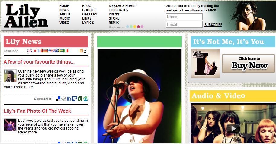 |
| Lily Allen's Website |
 |
| Kate Nash's website |
 |
| Pixie Lott's Website |
When looking at the four different websites i found that they had quite allot of similarities.
they all included :
Blogs-So that the artist can contact a wide variety f fans , this makes the artist seem as though (s)he are normal , and also keeps fans updated on what the artist is doing.
News- Continuous updates on what the artist is doing and positive articles of the artist.
Shop- Personalised merchandise for fans to buy.
Tour Dates- so fans know when the artist s performing next (a good way of advertising their next tour)
Videos - To promote music and also gives the fans and market visual understanding of the song
Photo Gallery- Shows different images to the artist ( casual shots which can show what a different image to the airbrushed posy pictures)
About (the artist)- Gives information about the artist ( usually abut their up bringing and how they became involed in the music industry) .
Website
I have created a website for our artist. By having a website it can help to get the artist known and let their music be heard. As the Internet is increasing and becoming the most popular way of searching for artists and finding upcoming artists , this will be the best way to advertise our artist. The website i have created is also free to set up. This helps as we don't have a big enough budget to buy expensive advertising space in magazines. The website is very new and still under construction.
http://www.nfgsjosevanders.webs.com/
http://www.nfgsjosevanders.webs.com/
Friday, 26 November 2010
Digipack - Planning
 We have decided on what our digipack will consist of, we aim to have a front cover, back cover, and a booklet that slots inside the album, which contains a list of all the song lyrics. As a group we looked at a variety of album covers, which also included a booklet. We discovered that all of these contain, song lyrics for each song included in the album, who wrote the songs and various pictures of the artist on each page. Beyonce's booklet had pictures posed purely for the album, but also had links to her upcoming tour which, like the album, was called 'I am Sasha Fierce'. We felt that we should include pictures of the music video we have created, we are not linking the video to the front and back cover, but as we plan for 'faces going places' to be Jose Vanders establishing song and video as an artist, we thought it would be relevant to include pictures from the video in the booklet to have something that consumers can relate to.
- We took a number of pictures when filming our video for the digipack, so we already have a number to chose from.
 We looked at Pixie Lott's album. She too had a booklet inside her CD, also containing song lyrics, the writers of the various songs, and a number of pictures of herself - the artist. She has used the 'x' in her name 'pixie' as a signature symbol, it appears on both the front cover, CD and in the booklet. I thought we should take this into consideration for our artist, especially as she is being introduced into the music industry. It gives her a signature symbol that consumers will remember her by and associate with her. I felt this couldn't be something random, and for the sake of it, so I thought about things we included in her video, and what we plan to include in her digipack, such as - cupcakes, a piano, teapots, scones etc. One of Pixie Lott's pages in the booklet, was a number of pictures, all of her personal life and her backround, such as school pictures, pictures with friends and family and holidays. We decided that we would like to do this too, as we have always planned for Jose Vanders to be relatable to the audience, and down to earth.
- As I am the artist, I have looked through many pictures from my personal life and picked ones which I felt would be suitable for the booklet, and maintained the image of Jose Vanders. We also took a few in school, again to ensure Jose Vanders' image remained.

Analysis of digi pack
Pixie Lott- Turn it up ( indie/pop)

It is a close up shot of Pixie, with her iconic back combed hair. Although their is no eye contact she is showing voyeuristic characteristics, she is drawing the audience in by the way she is looking toward the direction in which the case is opened, by having the sight line at her eyes its creates a slight sex appeal as the artist is drawing the audience to her eyes. Their is also a sticker on the top left corner advertising pixie Lott's three hit records. This help to advertise whats on the CD and also makes the album seem familiar as the buyer will be familiar with some of the songs .
The second Page of the Digi pack booklet includes , Track 1 and 2 with their song lyrics and song titles. They are in a pastel blue back ground with a pale blue cross which symbolises the X in Pixie. The opposite page is a picture of the artist with more voyeuristic characteristics. This is the artist creating a different image to what can be seen on the cover.
Page 3 consists of a green back ground, with a lighter green X. with the songs continuing on from the previous page.
The denotation of page 4 is the artist in with Bright coloured lighting, with her signature hairstyle, the connotation of the bright colours are to create a different image for the artist, this makes her seem less serious and pouty.
Page 5 is a continuation of the lyrics from the previous page . The background is a darker purple with a lighter purple cross.
Page 6 continues with the previous layout where their are lyrics on the left page and a picture of the artist on the right. In this shot the artist is showing More sex appeal with the m-e-s- of the picture, she is wearing a black dress and darker make up.
Page 7 and 8 is a double page long shot of the artist showing voyeuristic characteristics. This is to appeal at an older audience as she is trying show her maturity. But the out fit she is wearing is to lower the sex appeal by wearing a girly pink dress.
Page 9 is a continuation of the song lyrics, on a pink back ground with the signature X.
Page 10 is a casual image on the artist in shorts, a t-shirt and her signature hairstyle. This adds to her image of the girl next door.
Page 11 includes the last song and lyrics. It then follows on with a list of acknowledgements for each of the songs ,this includes writers and co writers etc.
Page 12 is based solely on acknowledgements , advertising her website and the record labels she is signed to.
Page 13 is a thank you from the artist , with a hand written signature. This makes it more personal from the artist to the audience.
Page 14 a whole page of smaller tiled images, which are personal images of the artist. This makes the artist seem 'normal' which can make her more relate able for her target audience.
The back cover is a close up of the artist looking straight at the camera, with a pouty expression, this is creating more sex appeal then the from cover , as the sight line of the artist contains voyeuristic characteristics as she is making eye contact with the audience.
The back cover of the CD case is a long shot of the artist, creating a sex appeal through the m-e-s, she is wearing black leggings and a baggy top.
Tuesday, 23 November 2010
Digipack Planning
Below is a link to a 'mind map' of the groups original thoughts and ideas into our digipack.
Digipack planning
Digipack planning
Thursday, 18 November 2010
Audience feedback
We have written a questionnaire for audience feedback where our video will be played in assembly to pupils at Newport free Grammar School. Their age range is between 11-18 and mixed gender. The questions we will include will be
1. Are you male or female ?
2. How old are you ?
3.What genre do you think this video is ?
Pop Indie Rock R&B Punk
4.Did you enjoy the video? Why ?
5.Do you feel the train worked with the piece? Why ?
1. Are you male or female ?
2. How old are you ?
3.What genre do you think this video is ?
Pop Indie Rock R&B Punk
4.Did you enjoy the video? Why ?
5.Do you feel the train worked with the piece? Why ?
Wednesday, 17 November 2010
Costume for Digipack
I have done some research into our artists costume for the album cover, we need to maintain the image we have created and therefore I have looked at the same clothing websites we looked at to find costume for the video. Websites such as topshop, urban outfitters, and independent vintage clothing websites. I looked at clothes by a designer called Catherine Ellis, who emphasises on the fact her clothes are made in England. This is appropriate to our artist, as we aim to emphasise on her being british, and we had previously done this in the music video by having her costume the same colours as the union jack flag (red, white and blue). This website was also great as many of the dresses were 'tea dresses', the type of dress we aimed for, these dresses being typically high cut.

Unfortunately we are unable to do the album cover we had originally planned and will now be using shots we took when shooting the video, therefore our artist will be in the same costume from the music video.

Unfortunately we are unable to do the album cover we had originally planned and will now be using shots we took when shooting the video, therefore our artist will be in the same costume from the music video.
Tuesday, 16 November 2010
Planning for photo shoot
We took the time to create a time table which have a list of our frees and when our media lessons are so we can organise a time when we can take photos for the digipack. We have also spoken to the teacher responsible for the hall time table in order to book a slot in the next two weeks to take the pictures.
(we uploaded the pictures below by taking a picture from a blackberry, then uploaded to facebok and the transferred to the blog)


(we uploaded the pictures below by taking a picture from a blackberry, then uploaded to facebok and the transferred to the blog)


Monday, 15 November 2010
Music videos which include the Alice in wonderland theme
http://www.trailerspy.com/trailer/8215/Alice-in-Wonderland-Music-Video-Alice-Underground
The music video in the link above uses the same conventions as the Alice in wonderland film. The music video is a different genre to our ours and so includes allot different conventions. But we can still use this as inspiration to our digipack.

This digipack cover (the one for the link above) Shows a close link with the Alice in wonderland film.
The artist clothes shows a link to Alice, as she wears a similar style of dress .But as she is a more punk singer she has a black dress to show her image. Her tights have a pattern of the cards which are in the film, they are known as being a 'baddy' in the film as they would for the evil queen of hearts. This has been done as it can relate to her rebellious image .
The font is also linked to the film Alice in wonderland as they use the same font for the title. Which they have displayed on the cover .
The setting of the shot is also very pop/rock as it is a green screened back ground , whereas our digipack cover will be less animated as the indie genre is about more natural shots and including the artist main instrument.
The music video in the link above uses the same conventions as the Alice in wonderland film. The music video is a different genre to our ours and so includes allot different conventions. But we can still use this as inspiration to our digipack.
This digipack cover (the one for the link above) Shows a close link with the Alice in wonderland film.
The artist clothes shows a link to Alice, as she wears a similar style of dress .But as she is a more punk singer she has a black dress to show her image. Her tights have a pattern of the cards which are in the film, they are known as being a 'baddy' in the film as they would for the evil queen of hearts. This has been done as it can relate to her rebellious image .
The font is also linked to the film Alice in wonderland as they use the same font for the title. Which they have displayed on the cover .
The setting of the shot is also very pop/rock as it is a green screened back ground , whereas our digipack cover will be less animated as the indie genre is about more natural shots and including the artist main instrument.
Subscribe to:
Posts (Atom)