Two conventions we used
1. Mise-En-Scene
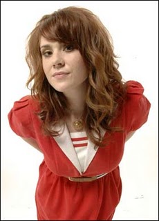
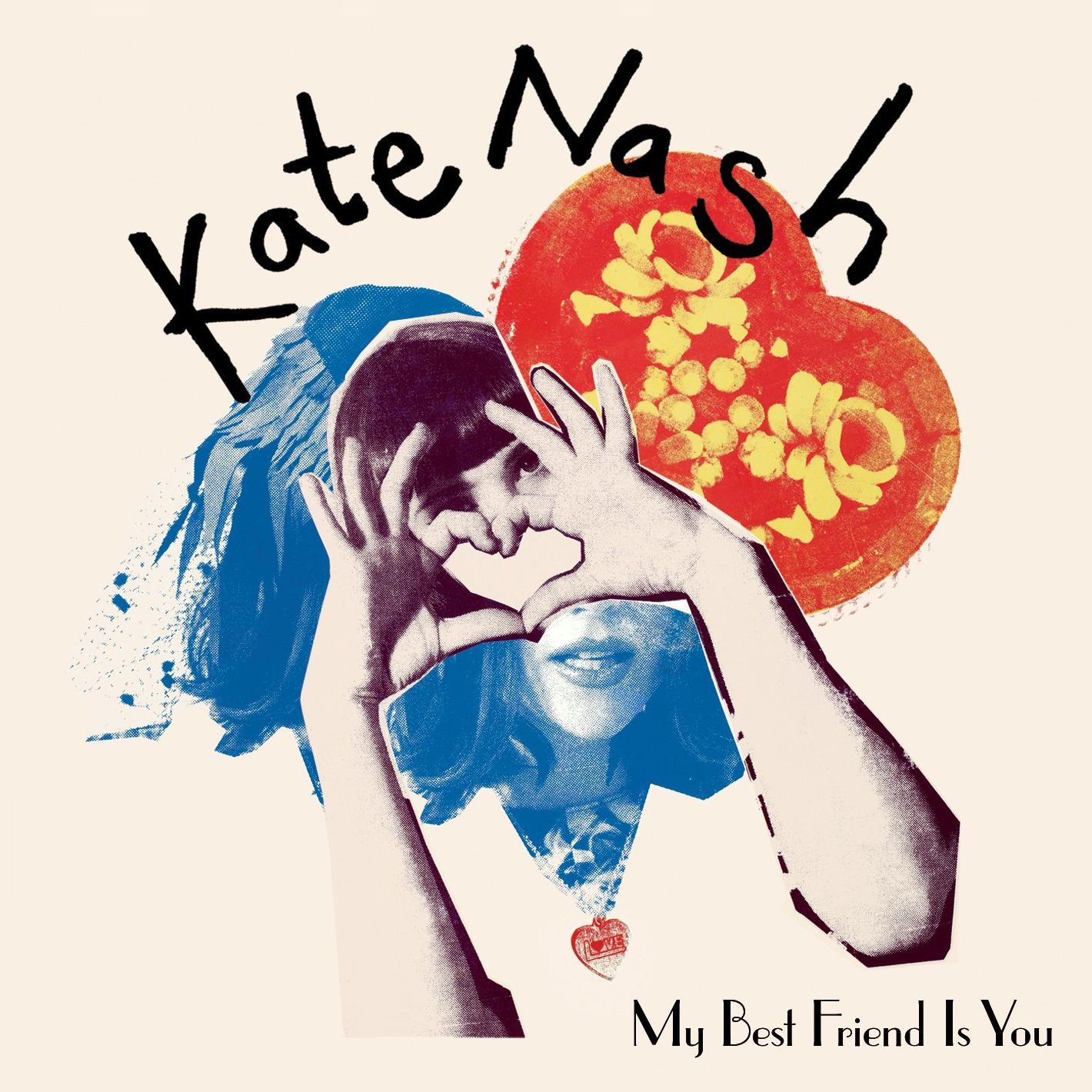
Kate Nash (Foundations)
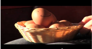
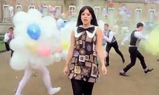
We took the idea of giving inanimate objects characteristics from Kate Nash's music video - 'Foundations'. Using this convention gives our artist the same quirky image illustrated in Kate Nash's videos and makes the horrors she is singing of about the world naive and childish - making it amusing rather than sad.
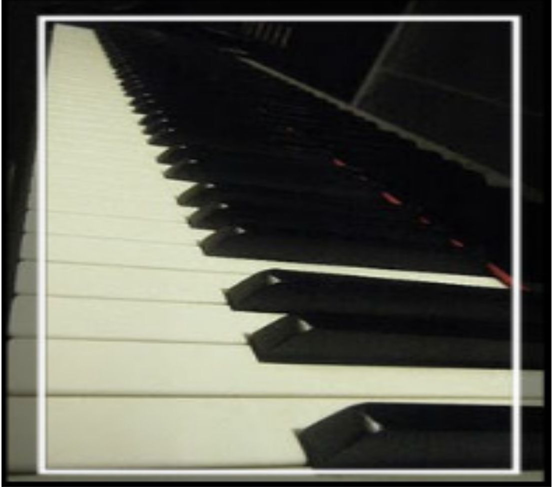
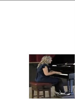
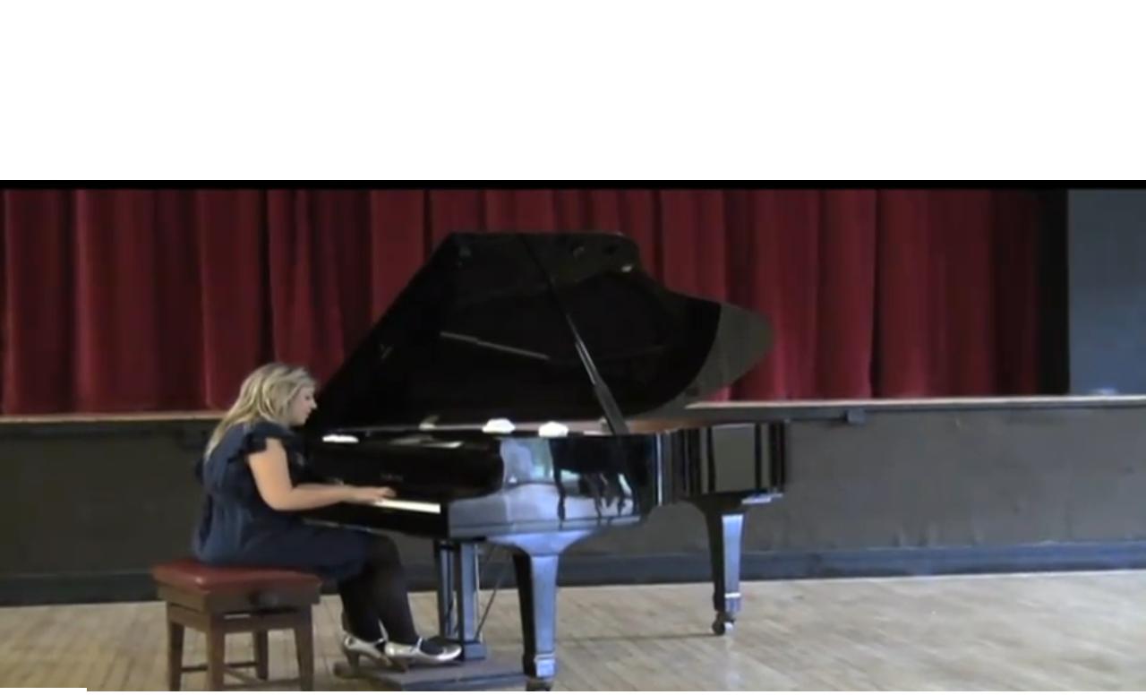
Vanessa Carlton (A Thousand Miles)

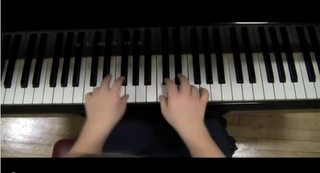
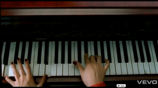
We took inspiration from Vanessa Carlton in shots to emphasise that she plays the piano.
We got ideas of camera angles from the piano used in the video as we wanted to include quite a bit of piano to show that she is a talented musicion rather than just a singer.
Our emphasise of the piano is a convention of indie music as it is a symble of indipendance, talent and shows the audience that all of the music is the that artist - they write, play and sing their own music. It demonstrates that they are their music.
Two conventions we developed
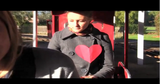
Roger Sanchez (Another Chance)

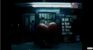
We took the physical heart that the female character carries - this developes our idea of making the lyrics literal.
We have developed it as the heart is used in Roger Sanchez's video to make the audience feel sympathy for the character. Whereas, in our video, it is used to make the lyrics more literal and portray a naivety in our artist. The placing of the paper heart suggests another reading of what she is seeing - the male is lookning looking at another girl's chest. It also carries on the happy tone to the song.
2. Mise-En-Scene
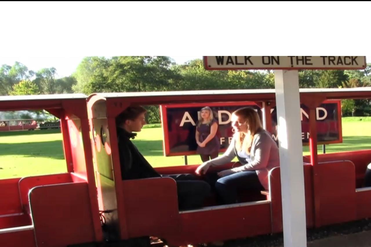
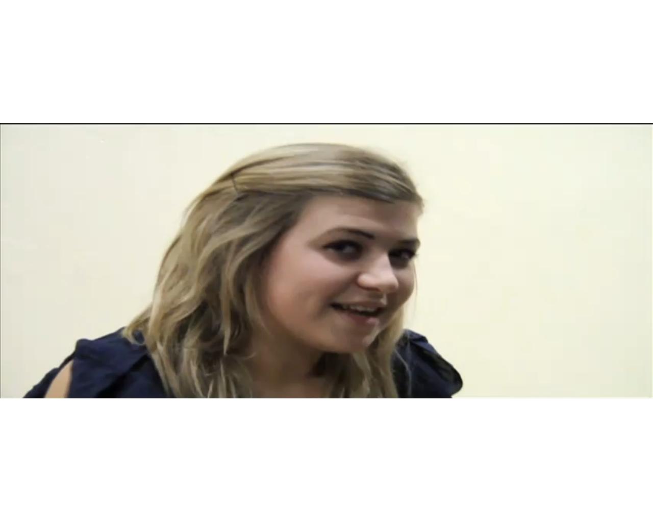
Kate Nash
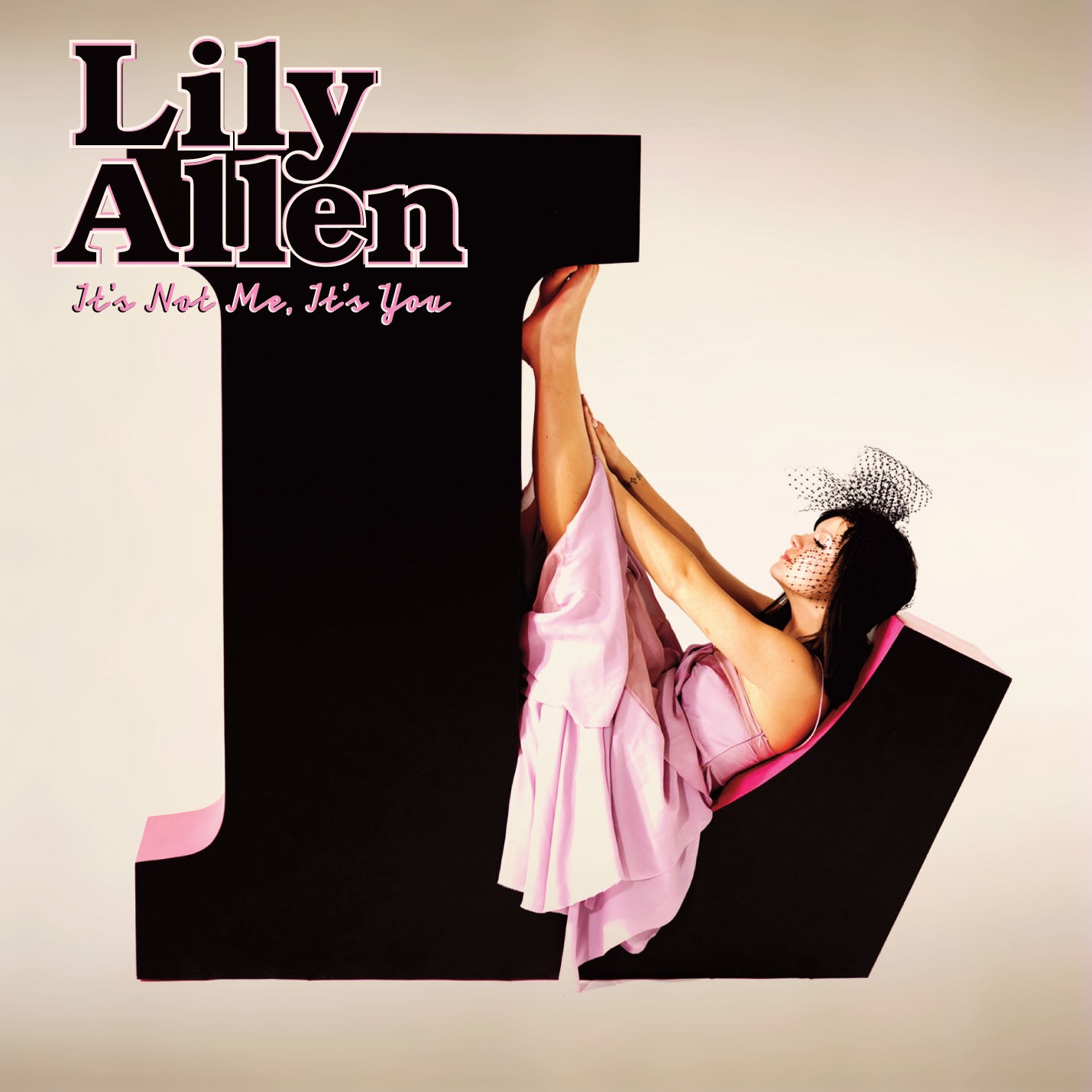
We have mainly focused on creating a similar image to Kate Nash and looked at Lilly Allen in her video 'The Fear' to back up the ideas that this look is up to date.
Dyer's star theory is that "A star is an image not a real person that is constructed". We have tried to make our artist look like a 'normal' person, someone that you would expect to see on the streets. But at the same time we have "constructed" her to look modest, respectful.
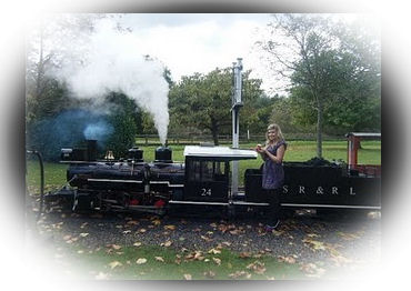
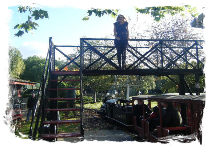
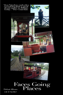
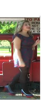
For the train station sequence we had our artist in a blue dress with red bows with a belt to show off her curves and red, white and blue shoes to fit in with the patriotic colour scheme (British flag). This also fits in with our very English orientated music video (cup cakes, miniture railway and English singer). The idea of using tights was from Lilly Allen as it makes the short length of the dress less voyeristic and sexual. We has our Artists hair down with the fringe clipped back. We kept it looking natural but putting the fringe up showed confidence by showing her face.